- Log in to:
- Community
- DigitalOcean
- Sign up for:
- Community
- DigitalOcean
By Andy Hattemer and Alligator

Introduction
You may have used the CSS position property with the relative and absolute values in the past. Modern web browsers now support the sticky value. It allows you to make elements stick when the scroll reaches a certain point.
An element with position: sticky will behave like a relatively-positioned element until it reaches a specified point and then starts behaving like a statically-positioned element.
In this article, you will create an example that uses position: sticky to understand how it behaves and functions.
Prerequisites
If you would like to follow along with this article, you will need:
- An understanding of CSS property and values.
- A code editor.
- A modern web browser that supports
position: sticky.
Using position: sticky
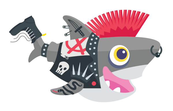
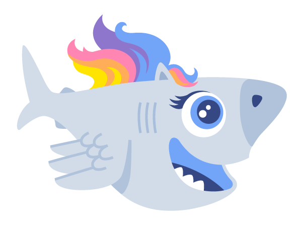
position: stickyConsider a div container that will be a flex container. Nested inside will be 4 additional div elements that will be the flex items. The 4 div elements will contain images for shark-1, shark-2, shark-3, and shark-4.
In your code editor, use the following markup:
<div class="container">
  <div class="item shark-1">
    <img
      src="/images/punk.png"
      width="100"
      alt="Sammy the Shark with a punk theme."
    >
  </div>
  <div class="item shark-2">
    <img
      src="/images/pony.png"
      width="100"
      alt="Sammy the Shark with a magical pony theme."
    >
  </div>
  <div class="item shark-3">
    <img
      src="/images/dino.png"
      width="100"
      alt="Sammy the Shark with a dinosaur theme."
    >
  </div>
  <div class="item shark-4">
    <img
      src="/images/steampunk.png"
      width="100"
      alt="Sammy the Shark with a steampunk theme."
    >
  </div>
</div>
And add the following styles:
.container {
  display: flex;
  justify-content: space-around;
  align-items: flex-start;
  border: 2px dashed rgba(114, 186, 94, 0.35);
  height: 400px;
  background: rgba(114, 186, 94, 0.05);
}

.shark-1 {
  position: sticky;
  top: 0;
}

.shark-2 {
  position: sticky;
  top: 4rem;
}

.shark-3 {
  position: sticky;
  bottom: 1rem;
  align-self: flex-end;
}
In this example, the align-items: flex-start rule on the flex container is important because otherwise flex items default to a value of stretch where the elements would take the whole height of the container, canceling the sticky effect.
Note: Check our flexbox primer if you’d like a refresher on the different flexbox properties and values.
Save this file and open it in a modern web browser:


Scroll up and down and observe the sticky behavior. Notice how sticky-positioned elements are only sticky within their parent element.
Warning: There are two common scenarios where a position: sticky element will not stick to the window as intended:
No inset property has been defined: Make sure the sticky element has top or bottom set. Or in the case of horizontal scrolling, left or right.
One of the element’s ancestors has incompatible overflow: If any of the parents or ancestors of the sticky element have overflow set to hidden, scroll, or auto. This also applies to overflow-x and overflow-y.
The first and second sharks are sticky relative to the top of the containing block established by the viewport. The third shark is sticky relative to the bottom of the containing block established by the viewport. The fourth shark will not scroll to a sticky position because it was not assigned position: sticky.
Conclusion
In this article, you created an example that uses position: sticky to understand how it behaves and functions.
As of 2020, 95% of browsers have some level of support for position: sticky. For details, reference Can I Use CSS position: sticky. Older versions of Safari will require the -webkit vendor-prefix. Ensure that your target audience can utilize this feature before incorporating it into your web applications.
If you’d like to learn more about CSS, check out our CSS topic page for exercises and programming projects.
Thanks for learning with the DigitalOcean Community. Check out our offerings for compute, storage, networking, and managed databases.
About the author(s)
Then: Learned to build the internet on DigitalOcean Community. Now: Building DigitalOcean Community on the internet.
Alligator.io is a developer-focused resource that offers tutorials and insights on a wide range of modern front-end technologies, including Angular 2+, Vue.js, React, TypeScript, Ionic, and JavaScript.
Still looking for an answer?
This textbox defaults to using Markdown to format your answer.
You can type !ref in this text area to quickly search our full set of tutorials, documentation & marketplace offerings and insert the link!
- Table of contents
- Prerequisites
- Using `position: sticky`
- Conclusion
Deploy on DigitalOcean
Click below to sign up for DigitalOcean's virtual machines, Databases, and AIML products.
Become a contributor for community
Get paid to write technical tutorials and select a tech-focused charity to receive a matching donation.
DigitalOcean Documentation
Full documentation for every DigitalOcean product.
Resources for startups and SMBs
The Wave has everything you need to know about building a business, from raising funding to marketing your product.
Get our newsletter
Stay up to date by signing up for DigitalOcean’s Infrastructure as a Newsletter.
New accounts only. By submitting your email you agree to our Privacy Policy
The developer cloud
Scale up as you grow — whether you're running one virtual machine or ten thousand.
Get started for free
Sign up and get $200 in credit for your first 60 days with DigitalOcean.*
*This promotional offer applies to new accounts only.
